Statistics deals with the collection, analysis, interpretation, and presentation of numerical data. Once data are gathered from an experimental study, it must be put into some kind of form—usually numerical—to be analyzed. The goal of statistics is to summarize data in a manner that allows for easy descriptions or inferences to be made.
Descriptive statistics involves two major aspects of data: central tendency and variance. Central tendency and variability measures are used to interpret the meaning and value of data. Once these measures have been determined, graphs and charts are often used to illustrate the results of the data in a clear and concise manner.
Central Tendency
Central tendency is most commonly referred to as the numerical center of the data set: it is a single number that is used to represent a group of numbers. There are three common representations of central tendency: the mean, median, and mode.
The mean is the average value of a data set. In the data set (1, 3, 3, 4, 5, 6), the average would be the sum of all of the values of the data set (22), divided by the total number of values (6), which gives a mean of 3.66 for this data set. The mean can only be calculated with interval and ratio data. One limitation of the mean is that it is significantly influenced by outliers (numbers which fall far from the data set's median); when this happens, the median becomes a better measure of the data set's center.
The median is the value found in the middle of an ordered set of data (where the data set is ranked from lowest to highest). If the data set is made up of an even number of values, then the two middle values should be averaged to find the median. In the data set (1, 3, 3, 4, 5, 6), the median would be the value found between the two middle numbers of the set 3 and 4. Thus the median of this data set is 3.5. The median can be computed for ordinal, interval, and ratio data.
The mode refers to the most commonly occurring value in a data set. In the data set (1, 3, 3, 4, 5, 6), 3 is the mode because it is the value which appears most often; because it is the only mode, it is considered to be the single modal value. In a similar data set (1, 3, 3, 4, 5, 5, 6), the mode would be both the values 3 and 5; this would be a multi-modal value. The mode is the least influential measure of central tendency because little insight is gathered from its calculation.
Variability Measures
A data set involves a range of values. The standard deviation and variance are related and involve how much individual data differs from the data set's mean. There are three variability measures of a data set: range, standard deviation, and variance.
The range is the difference between the highest and lowest values of a variable, often found by subtracting the lowest from the highest value found. The range is often an unstable identifier of variability because it can be overly influenced by a single outlying value, and often these outliers are removed from the data set to ensure more representative results.
The variance is the mean squared deviation of a data set, meaning it is the sum of the squared deviations of the mean divided by the total population. It is the sum of the deviation squared divided by the number of values—thus, the average distance of a value from the mean.
The standard deviation is calculated as the square root of the variance. This resulting quantity is in the same units as the original values, overcoming the limitation on interpreting the variance.
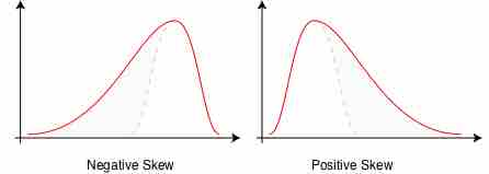
Another way to measure the variability of the data is through skewness. Ideally, a variable will be normally distributed, meaning that the mean, median, and mode are all identical. If the mean is greater than the median, and the median is greater than the mode, the distribution will be positively skewed. However, if the mean is less than the median, and the median is less than the mode, then the distribution will be negatively skewed.

Skewness
When the mean, median, and mode are unequal, the normal curve can become skewed in either a negative or positive direction depending on their values in relation to each other. In each of the above panels, the dotted line shows how a normal distribution would be shaped (if the mean and median were equal). In the left panel, showing negative skew, the mean is less than the median; in the right panel, showing positive skew, the mean is greater than the median.
Visualizing Descriptive Statistics
When a researcher computes descriptive statistics, they will usually want to create visual representations to help them better understand their data. This is better known as "exploratory data analysis". Often researchers will want to start with a frequency distribution, which is simply a table that organizes the data in a logical order so they can count the number of times each value occurred. For example, if we have collected reaction times of people responding to a stimulus, a frequency distribution would allow us to see the number of times each possible reaction time occurred.
Stem-and-Leaf Plot
A stem-and-leaf plot is one way to visualize the frequencies. Stem-and-leaf plots retain the individual values and the frequencies of those values, and also give an idea of the shape of the distribution of the data.
Stem-and-leaf plot
"Leading numbers" are shown in the "stem" (the column on the left-hand side), and "trailing numbers" are shown in the "leaves" (the lists on the right-hand side). In this example, the first row represents the numbers 1, 1, 2, 2, etc.; the second row represents the numbers 10, 10, 10, 11, 11, 13, etc.; and so on.
Histogram
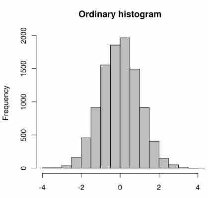
A histogram helps researchers visualize the distribution of their data. Each histogram contains columns that are used to represent the number of data points within each interval, or "bin."

Histogram
This histogram displays normally distributed data (it is shaped like a symmetrical bell, meaning the median is roughly equal to the mean). Each column represents the number of data points of observations within that interval, or "bin." For example, the first two intervals, or "bins," are on the x-axis, and frequencies are on the y-axis.
Boxplot
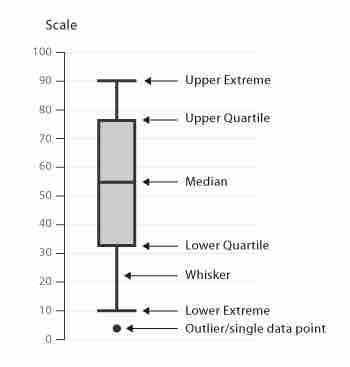
A researcher may also want to use a boxplot to better understand the variability in a sample. A boxplot is a graphical representation of the dispersion of data. A boxplot provides information about the median value, the spread of the data and range, and statistical outliers.

Boxplot
A boxplot has marks to indicate the upper and lower extreme, as well as the upper and lower quartile and median of the data.