Introduction
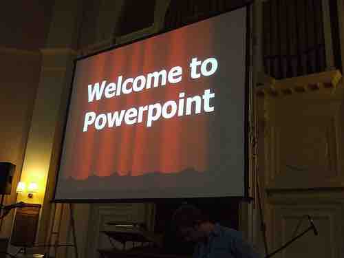
Let's face it. Love it or hate it, PowerPoint, or PowerPoint type slides, are the most common form of visual aid seen during a presentation. We all know that we have encountered boring power points presentations with an overload of information and lack of creativity. Developed by Microsoft, PowerPoint is a presentation software that enables users to communicate text, graphics, video, and other content via electronic slides.
The following design tips can help users develop effective PowerPoint presentations, while keeping in mind PowerPoint etiquette .

PowerPoint Presentation
Using easy-to-read, large fonts is one tactic for designing useful presentations.
PowerPoint Tips
- Do not write the entire presentation on your PowerPoint. Instead, create bullet points and headings no longer than three to five words that give the main points.
- Present no more than five to seven lines per slide.
- Use two slides rather than cramming too much information into one.
- Be consistent with your "theme" throughout the presentation (i.e., do not use a different theme for each slide).
- Do not overuse transitions. They are meant to enhance, not overwhelm your presentation.
- Be careful with your color scheme. Again, this is meant to enhance your presentation. Make sure the audience can read the text.
- Make an outline of what you will be talking about so listeners can know what to expect from the presentation.
- Use at least an 18-point font for main points and a smaller sized font for sub-points. Avoid using complicated and unreadable font.
- Use a font color that stands out against the background.
Easy-to-Read Text and Graphics
Use graphics! People identify items more quickly with images rather than just text alone. When creating your visual aids, however, make sure your text and graphics are readable.
Labeling
- Use headlines and sub-headlines in a larger font.
- Bold, italicize, or CAPITALIZE important information.
- Use bullet points or create lists to organize material. Make sure this is "nice" to look at (i.e., easy-to-read).
Charts and graphs
- Make sure the information is clear and supports your presentation. Color coordinate charts/graphs if necessary.
- Use text to support/explain your charts and graphs (be brief but cover the high points).
- Avoid charts and graphs that can be misleading to your readers.
Wording and Lettering
- Use large, easy-to-read fonts.
- Be concise, using as little text as possible. Also use simple language to avoid confusion.
- Limit your text to one or two fonts.
- Think of the demographic (e.g., age) of your audience when setting font size and type.
- Minimize the number of lines to no more than six lines per slide with six words per line.
→Overcrowding slides is common and can be easily avoided by limiting the amount of text.
Color
- Use color for clarity and emphasis, not for decoration.
- Use color schemes.
- Keep a similar color scheme throughout the entire presentation.
- Use contracting colors to highlight main points.