PowerPoint Features
PowerPoint incorporates elements of written, oral, and visual communication. By focusing on decisions regarding blank space or color, contrast, and font, you can design a presentation that is not only aesthetically appealing, but also enhances and underscores key content and objectives. The following tips will help you and your audience get the most from your presentation.
Formatting the Slide
Templates: You may either select an existing template or design your own. The blank template allows you to modify colors, themes, and the style of different elements to best suit your needs.
Normal view - Blank Presentation template: The blank presentation template provides placeholders for title and sub-title on the first slide, and additional placeholders for the title on each blank slide. This allows you to distinguish your main points from sub-points. Follow basic design rules:
- Use blank space to group or separate items.
- Use visual balance to please the eye.
- Create contrast to make objects stand out . Contrast occurs when any two elements are different.
Colors: Choose colors so that text is clearly legible . In addition, consider how the colors will look in the space where the slideshow will be presented. For example:

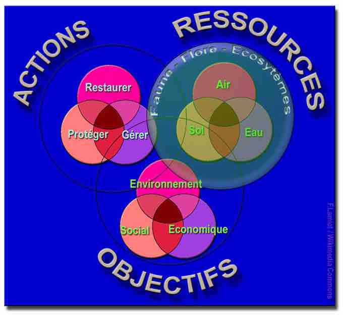
Graphic and colored representation of the interrelationships between main areas of sustainable development.
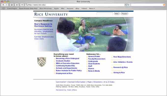
Notice color contrast and fonts.
- Strong light reduces contrast on dark background.
- In a well-lit room, use light background with dark text and visuals.
- In a dimly-lit room, use dark background with light text and visuals.
- Avoid vibrating colors. Bright complementary colors that are close to each other in intensity "vibrate," or reduce legibility.
Adding Content
Text: Use text properly.
- Use keywords and phrases instead of sentences.
- Be consistent in your use of capitalization.
- Put similar ideas in the same formatting by using the same parts of speech, same clauses, phrases, or all complete sentences.
- Use bullet points. Bullets help the audience skim the slide and see relationships between main and sub-points. Here is how to use bullets:
- Select the "bulleted list" or "two-column list" slide (from the pre-designed slide formats).
- Type a phrase then hit "return. "
- Type a second phrase, hit "return" then hit "tab" to indent.
- OR use "promote" or "demote" arrows at top to create a bulleted hierarchy, in order to distinguish main claims from subclaims.
Fonts: Choose easy-to-read fonts.
- Select fonts that are good for projecting, not ones that are just good for printing.
- Pay attention to the legibility of the font you choose, such as the contrast between background and text, size of the font, and any type treatment such as shadowing that may reduce legibility.
Graphics: Insert needed visuals such as WordArt, shapes, or images. Make sure to re-size the images to best fit the slide. Here is how to re-size images:
- Click on the visual you wish to resize.
- Go to "format" and then "object" or "autoshape. "
- Select "size. "
- Change size and scale.
- OR, simply click and drag the corners of the image.
- You can also combine two different shapes by selecting one and then selecting and dragging another into it for a custom image.
Video and Audio: You can search and select video in different media formats. Just click to select the video/audio and insert where you want them to play on the slide. You can also record your own audio to add to a slide. When choosing video or audio to add to your presentation, make sure that it is of a high quality. This enhances the authority of the presenter as well as improves audience receptivity.
Moving Between Slides
Effects and transitions: PowerPoint comes with a preset collection of transitions. You can choose different types of transitions to move between slides. Newer versions of PowerPoint even have some 3D transitions. In addition, there are many free transition templates available from Microsoft and open sources.
Effects between slides: Effects should have a point and support the overall concept of the presentation. Avoid slow moving or fancy effects such as crawl in, swivel, and spiral. Don't overuse special effects as they can distract your audience from your main points. To avoid this from happening, keep effects and transitions consistent.
After the Presentation
Handouts: You can export your PowerPoint presentation to a Word Document. When you do this, there are different choices available for how slides and notes are positioned. In the latest version of PowerPoint you can go to File----> Export and then click on the {Create Handouts} button. Your presentation will then be exported to a Word document for formatting.
Share: You can also share your PowerPoint presentation by email, through web access. or publish your slides so that others can access them electronically rather than having to distribute handouts.

Organize with blank Space
Identify groups of items separated by blank space

Contrast to group or emphasize
Contrast by font, color, or size