 |
This is a file from the Wikimedia Commons. Information from its description page there is shown below.
Commons is a freely licensed media file repository. You can help.
|
Summary
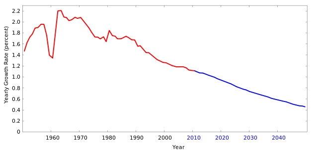
A chart of changes in world population growth rate from 1950–2010 (red) and predicted changes in world population growth rate from 2010–2050 (blue).
The original was created 6 Dec 2003 by Securiger from data provided by the U.S. Census Bureau.
Converted to SVG by Conscious.
History on English Wikipedia
- (Delete all revisions of this file) (cur) 22:14, 27 March 2006 . . Casito (Talk | contribs | block) . . 1200×900 (11,907 bytes) (Excel Graphs look unprofessional. This is done in GNUPlot using the same source data. Also adjusted to show the more useful percent growth (vs. abs. growth))
- (del) (rev) 15:50, 26 August 2005 . . Riumplus (Talk | contribs | block) . . 512×400 (3,103 bytes) (Removed unused colours from the PNG pallete, shrinking the file size by 41%)
- (del) (rev) 13:23, 6 December 2003 . . Securiger (Talk | contribs | block) . . 512×400 (5,242 bytes) (A chart of changes in world population 1952-2002)
Licensing
 |
Permission is granted to copy, distribute and/or modify this document under the terms of the GNU Free Documentation License, Version 1.2 or any later version published by the Free Software Foundation; with no Invariant Sections, no Front-Cover Texts, and no Back-Cover Texts.
Subject to disclaimers.www.gnu.org/copyleft/fdl.htmlGFDLGNU Free Documentation Licensetruetrue
|
File usage
The following pages on Schools Wikipedia link to this image (list may be incomplete):
This file contains additional information, probably added from the digital camera or scanner used to create or digitize it. If the file has been modified from its original state, some details may not fully reflect the modified file.
SOS Children chose the best bits of Wikipedia to help you learn. SOS Children is there for the children in our care until they are ready for independence. There are many ways to help with SOS Children.


