
File:Sourav Ganguly Graph.png
| |
This is a file from the Wikimedia Commons. Information from its description page there is shown below.
Commons is a freely licensed media file repository. You can help. |
| Description |
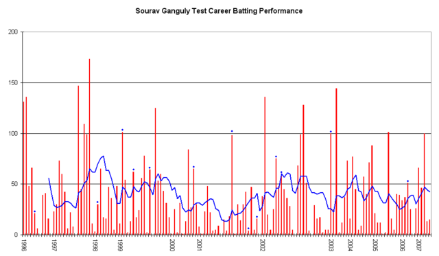
This graph details the Test Match performance of en:Sourav Ganguly. It was created by Raven4x4x. The red bars indicate the player's test match innings, while the blue line shows the average of the ten most recent innings at that point. Note that this average cannot be calculated for the first nine innings. The blue dots indicate innings in which Ganguly finished not-out. This graph was generated with Microsoft Excel 2002, using data from Cricinfo and Howstat.com.au. The information in this chart is current as of 2 June, 2007. |
| Date | 2005-11-28 (first version); 2007-06-02 (last version) |
| Source | Originally from en.wikipedia; description page is/was here. |
| Author | Original uploader was Raven4x4x at en.wikipedia |
| Permission ( Reusing this file) |
Released into the public domain (by the author). |
Licensing:
 |
This work has been released into the public domain by its author, Raven4x4x at the wikipedia project. This applies worldwide. In case this is not legally possible: |
File usage
Schools Wikipedia and SOS Children
This selection has made Wikipedia available to all children. SOS Children believes education is an important part of a child's life. That's why we ensure they receive nursery care as well as high-quality primary and secondary education. When they leave school, we support the children in our care as they progress to vocational training or higher education. Help another child by taking out a sponsorship