 |
This is a file from the Wikimedia Commons. Information from its description page there is shown below.
Commons is a freely licensed media file repository. You can help.
|
| Description |
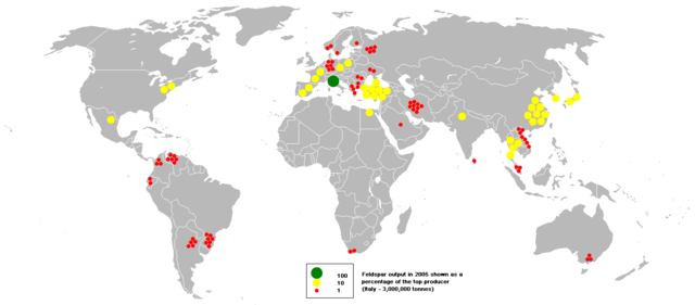
English: This bubble map shows the global distribution of feldspar output in 2005 as a percentage of the top producer (Italy - 3,000,000 tonnes). For example two yellow circles in France means French output is 20% of the top producer Italy.This map is consistent with incomplete set of data too as long as the top producer is known. It resolves the accessibility issues faced by colour-coded maps that may not be properly rendered in old computer screens.
Data was extracted on 2nd June 2007. Source - http://www.bgs.ac.uk/mineralsuk/commodity/world/home.html Based on :Image:BlankMap-World.png
|
| Date |
2 June 2007 (original upload date) |
| Source |
Transferred from en.wikipedia; transferred to Commons by User:Stefan4 using CommonsHelper. |
| Author |
Original uploader was Anwar saadat at en.wikipedia |
Permission
( Reusing this file) |
CC-BY-SA-3.0.
|
Licensing
|
Anwar saadat at en.wikipedia, the copyright holder of this work, hereby publishes it under the following license:
|
File usage
The following pages on Schools Wikipedia link to this image (list may be incomplete):
SOS Children's Villages aims to make Wikipedia suitable for young learners. SOS Childrens Villages is there for the children in our care until they are ready for independence. Will you help another child today?


