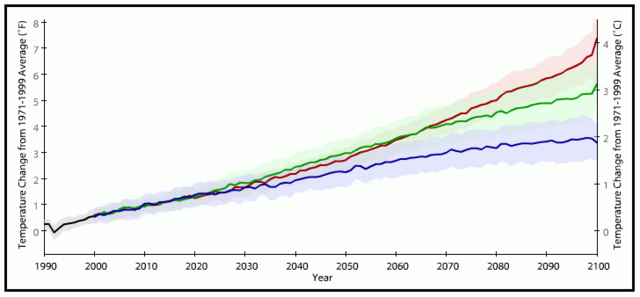
English: Based on the cited public-domain source: The graph shows the average of a set of temperature simulations for the 20th century (black line), followed by projected temperatures for the 21st century based on a range of emissions scenarios (colored lines). The shaded areas around each line indicate the statistical spread (one standard deviation) provided by individual model runs. (Data processing by Jay Hnilo, CICS-NC, using data courtesy the Coupled Model Intercomparison Project, or CMIP3.) Temperature changes are measured against the 1971-1999 average. Results from a wide range of climate model simulations suggest that our planet’s average temperature could be between 2 and 9.7°F (1.1 to 5.4°C) warmer in 2100 than it is today.
The net impacts of human actions and choices on future greenhouse gas concentrations are fed into models as different “scenarios.” For example, the scenario represented by the blue trend line above (IPCC Scenario B1) assumes that humans worldwide will make more sustainable development choices by using a greater range of, and more efficient, technologies for producing energy. In this scenario, carbon emissions are projected to increase from today’s rate of about 9 billion metric tons per year to about 12 billion tons per year in 2040, and then gradually decline again to 1990 levels—5 billion tons per year—by 2100.
The scenario represented by the red trend line (IPCC Scenario A2) assumes humans will continue to accelerate the rate at which we emit carbon dioxide. This is consistent with a global economy that continues to rely mainly on coal, oil, and natural gas to meet energy demands. In this scenario, our carbon emission increases steadily from today’s rate of about 9 billion tons per year to about 28 billion tons per year in 2100. The middle trend (green, IPCC Scenario A1b) assumes humans will roughly balance their use of fossil fuels with other, non-carbon emitting sources of energy.
For B1, the projected temperature in 2030 is around 1.6 °F, with a statistical spread (s.s.) (one standard deviation) ranging between 1.2-2.2 °F. The other two scenarios (A2 and A1b) are very similar to this. By 2060, B1 increases to around 2.7 °F, with a s.s. of around 2-3.3 °F. A1b increases to around 3.5 °F, with a s.s. of around 2.9-4.2 °F. A2 increases to around 3.5 °F, with a s.s. of around 3-3.9 °F. A1b increases to around 3.5 °F, with a s.s. of around 2.9-4.2 °F. By 2090, B1 increases to around 3.4 °F, with a s.s. of around 2.6-4.2 °F. A1b increases to around 4.8 °F, with a s.s. of around 3.9-5.8 °F. A2 increases to around 5.8 °F, with a s.s. of around 5.1-6.6 °F.
Because temperature projections depend on the choices people make in the future, climate scientists can’t say which one of the scenarios is more likely to come to pass by the end of the century. These scenarios are estimates, and greenhouse gas concentrations may grow at rates that are higher or lower than the scenarios shown in the graph. If future carbon dioxide emissions follow the same trajectory as they have over the last decade, increasing at a rate of more than 3 percent per year, carbon dioxide levels in the atmosphere would exceed the scenario represented by the red line (IPCC scenario A2) by the end of this century, if not before.
The source website (requires Flash) allows the graph's axes to be adjusted in scale, the x-axis moved left and right, and the y-axis up and down.
File:Map of projected global warming across the globe by the 2050s. Projections based on three SRES greenhouse gas emissions scenarios. Data from CMIP3 (2007).jpg shows maps of temperature changes across the world for these three scenarios.


