In statistics, the frequency (or absolute frequency) of an event is the number of times the event occurred in an experiment or study. These frequencies are often graphically represented in histograms. The relative frequency (or empirical probability) of an event refers to the absolute frequency normalized by the total number of events. The values of all events can be plotted to produce a frequency distribution.
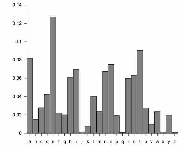
A histogram is a graphical representation of tabulated frequencies , shown as adjacent rectangles, erected over discrete intervals (bins), with an area equal to the frequency of the observations in the interval. The height of a rectangle is also equal to the frequency density of the interval, i.e., the frequency divided by the width of the interval. The total area of the histogram is equal to the number of data. An example of the frequency distribution of letters of the alphabet in the English language is shown in the histogram in .

Letter frequency in the English language
A typical distribution of letters in English language text.
A histogram may also be normalized displaying relative frequencies. It then shows the proportion of cases that fall into each of several categories, with the total area equaling 1. The categories are usually specified as consecutive, non-overlapping intervals of a variable. The categories (intervals) must be adjacent, and often are chosen to be of the same size. The rectangles of a histogram are drawn so that they touch each other to indicate that the original variable is continuous.
There is no "best" number of bins, and different bin sizes can reveal different features of the data. Some theoreticians have attempted to determine an optimal number of bins, but these methods generally make strong assumptions about the shape of the distribution. Depending on the actual data distribution and the goals of the analysis, different bin widths may be appropriate, so experimentation is usually needed to determine an appropriate width.