Distributions Constructed by Others
Unless you are constructing a graph of a distribution on your own, you need to be very careful about how you read and interpret graphs. Graphs are made in order to display data; however, some people may intentionally try to mislead the reader in order to convey certain information.
In statistics, these types of graphs are called misleading graphs (or distorted graphs). They misrepresent data, constituting a misuse of statistics that may result in an incorrect conclusion being derived from them. Graphs may be misleading through being excessively complex or poorly constructed. Even when well-constructed to accurately display the characteristics of their data, graphs can be subject to different interpretation.
Misleading graphs may be created intentionally to hinder the proper interpretation of data, but can also be created accidentally by users for a variety of reasons including unfamiliarity with the graphing software, the misinterpretation of the data, or because the data cannot be accurately conveyed. Misleading graphs are often used in false advertising.
Types of Misleading Graphs
The use of graphs where they are not needed can lead to unnecessary confusion/interpretation. Generally, the more explanation a graph needs, the less the graph itself is needed. Graphs do not always convey information better than tables. This is often called excessive usage.
The use of biased or loaded words in the graph's title, axis labels, or caption may inappropriately prime the reader.
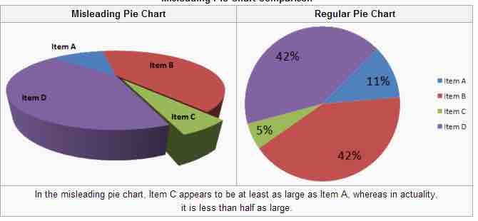
Pie charts can be especially misleading. Comparing pie charts of different sizes could be misleading as people cannot accurately read the comparative area of circles. The usage of thin slices which are hard to discern may be difficult to interpret. The usage of percentages as labels on a pie chart can be misleading when the sample size is small. A perspective (3D) pie chart is used to give the chart a 3D look. Often used for aesthetic reasons, the third dimension does not improve the reading of the data; on the contrary, these plots are difficult to interpret because of the distorted effect of perspective associated with the third dimension. In a 3D pie chart, the slices that are closer to the reader appear to be larger than those in the back due to the angle at which they're presented .

3-D Pie Chart
In the misleading pie chart, Item C appears to be at least as large as Item A, whereas in actuality, it is less than half as large.
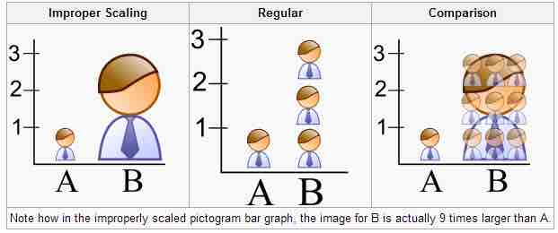
When using pictogram in bar graphs, they should not be scaled uniformly as this creates a perceptually misleading comparison. The area of the pictogram is interpreted instead of only its height or width. This causes the scaling to make the difference appear to be squared .

Improper Scaling
Note how in the improperly scaled pictogram bar graph, the image for B is actually 9 times larger than A.
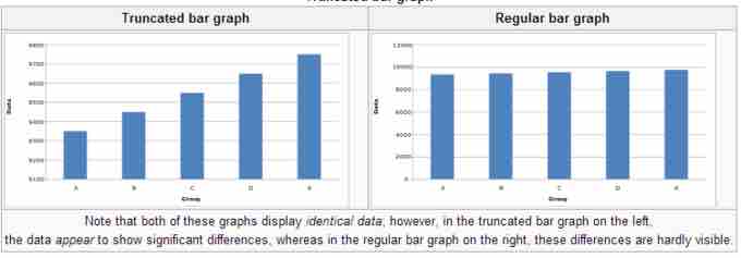
A truncated graph has a y-axis that does not start at 0. These graphs can create the impression of important change where there is relatively little change .

Truncated Bar Graph
Note that both of these graphs display identical data; however, in the truncated bar graph on the left, the data appear to show significant differences, whereas in the regular bar graph on the right, these differences are hardly visible.
Usage in the Real World
Graphs are useful in the summary and interpretation of financial data. Graphs allow for trends in large data sets to be seen while also allowing the data to be interpreted by non-specialists. Graphs are often used in corporate annual reports as a form of impression management. In the United States, graphs do not have to be audited as they fall under AU Section 550 Other Information in Documents Containing Audited Financial Statements. Several published studies have looked at the usage of graphs in corporate reports for different corporations in different countries and have found frequent usage of improper design, selectivity, and measurement distortion within these reports. The presence of misleading graphs in annual reports have led to requests for standards to be set. Research has found that while readers with poor levels of financial understanding have a greater chance of being misinformed by misleading graphs, even those with financial understanding, such as loan officers, may be misled.