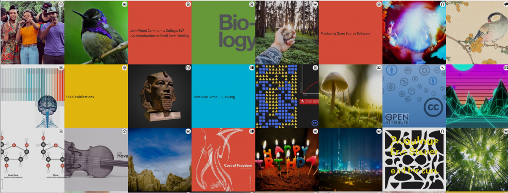
One of the projects I knew I wanted to take on when I joined Creative Commons as CEO was a major website redesign. The CC site has always been a valuable source of information about our mission, our community, and the legal tools we offer. While there’s a lot of new things happening at CC, our website didn’t reflect that with an old design. Also, with 1.1 billion works in the commons, it’s sad not to show any of that vibrancy in our site. My goal was for Creative Commons to have a website that more clearly communicated what we do, reflected the commons back to our community, and also looked modern, clean, and beautiful.
I’m extremely happy to say that Creative Commons now has that website. Over the summer we soft-launched a brand new version of CreativeCommons.org. Today, after several weeks of fixing bugs and tidying up content, we’re celebrating with a public announcement about the redesign to our partners, friends, and followers online.
Besides a much-needed aesthetic overhaul, you’ll notice that the new site more clearly outlines our work across all fields, from arts and culture to education to science. Some other highlights include a newly designed blog and a dynamic section at the bottom of our homepage that will keep you apprised of the wide array of incredible creative projects in the growing commons.
We worked closely with the Vancouver-based web firm Affinity Bridge on the new site, and I cannot say enough what a joy it was to collaborate with such a talented and insightful group. I’m also grateful to Matt Lee and Rob Myers for their efforts to bring the new site online, and preserve over a decade’s worth of content. A huge thank you to our community and members of the Creative Commons board and advisory board for all their feedback on the new design.
We’re not finished, of course. A website is a living, breathing thing, and we’ll continue improving and building ours out over time. The next phase of our work will include improvements to our fundraising infrastructure, and also the development of a WordPress template that our affiliates can customize for their own pages. It will build on the look and feel of the main site, but will make it easy for affiliates to set up their own pages without building new sites.
I hope you’ll find a few minutes to explore the new site, if you haven’t already. As you come across any bugs or issues that you think we should take a look at, please feel free to report them to us on GitHub.


