This story was researched and written in collaboration with Creative Commons staff. You can also read the story on Medium.
On February 14, 2015 New York’s Museum of Modern Art welcomed the public to a new exhibit, “This is For Everyone: Design Experiments for the Common Good.” Inspired by a short tweet made by Tim Berners-Lee, the inventor of the World Wide Web, “This is For Everyone” includes an array of fascinating objects, concepts, designs, and artworks that were conceived to serve the global public in sometimes unexpected or serendipitous ways. Winding through the exhibit, viewers will find curious and ubiquitous objects and technology that speak to the empowerment of individual creativity. Displayed on the white walls next to the internationally embraced symbols for the on/off button, recycling, and the @ symbol, one will find a mark of equally great significance: the “double-C in a circle,” or simply, the “CC,” Creative Commons mark.
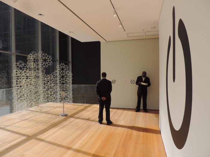
Creative Commons logo and installation view of “This Is for Everyone: Design Experiments for the Common Good” by Jim.Henderson
Copyright and related rights waived via CC0
This most visible icon of the free culture movement is on view in the exhibit, but the MoMA took even further steps to recognize the impact and importance of the “CC” logo and its accompanying ShareAlike, NonCommercial, Attribution, and NoDerivatives icons. On March 4, 2015 MoMA Senior Curator Paolo Antonelli announced that the Creative Commons logo had been formally acquired as part of the museum’s permanent collection. It is both a symbolic and very practical kind of acquisition. As part of the collection, the icons and their history will enjoy perpetual protection and recognition by MoMA. But their work is far from complete: like so many of the other instantly-recognizable icons in the MoMA collection, the “CC” logo will continue to be used and appreciated by millions of people in millions of situations, and for many years to come.
The logos have had an incredible influence on the Internet and global society, and far-reaching, future impacts are coalescing every day. The world knows a lot more about Creative Commons in 2015 than it did almost 14 years ago when the organization was founded, but few know how the logos came to be, who created them, and what informed their creation.
The Creative Commons logos are special and powerful symbols that speak to the origin and roots of the organization that created them. Creative Commons was founded in 2001 by law professor Lawrence Lessig, Hal Abelson, and Eric Eldred to address a problem created by antiquated copyright laws in the U.S. and around the world. In an era where it was becoming easier to share works via the Internet, copyright law seemed to be moving in the other direction by increasing term limits and restrictions on reuse. Amidst this tension, how could artists, researchers, and other creators share their works widely and freely online without infringing on each other’s copyright? At the time, there was no way for a creator to grant blanket permissions for reuse, other than to hire their own lawyer to write custom copyright terms. Creative Commons rose to tackle this challenge with its revolutionary, human- and machine-readable copyright licenses, which anyone could freely use. But with these powerful new licenses in hand, how would people be able to visibly indicate their preferences for reuse?
A designer and a roomful of lawyers get to work
Glenn Otis Brown joined as the second Executive Director of Creative Commons in 2002, taking over for Molly Shaffer Van Houweling to oversee the launch of the CC license suite. Along with Van Houweling, the organization’s founders, early staff and Board collaborators Neeru Paharia and Ben Adida, Brown played a key role in developing the first versions of the human- and machine-readable licenses, and would ultimately be presented with the challenge of building the visual identity system for Creative Commons.
It was a random encounter on a plane leaving SXSW in 2002 when Glenn bumped into designer/animator (and former classmate) Ryan Junell, that led to a graphic design and branding project which would ultimately bring about the Creative Commons logos. Ryan and Glenn were originally classmates at the University of Texas at Austin in the mid-90’s, sitting in on lectures that covered the early and optimistic days of the Internet, and gaining an advanced understanding of how the web would shift perspectives on sharing and copyright.
When Glenn and Ryan reconnected in 2001 Glenn had a big vision for Creative Commons and an amazing design problem to solve. Progress on the CC licenses was well underway. A legal team and the early staff, including Molly and Glenn, were working hard at Stanford’s Center for Internet and Society (founded by Lawrence Lessig in 2001) to craft these new, freely reusable licenses that were intended to be understood by both legal professionals in the world of IP law, and everyday creators and users with minimal legal experience or knowledge.
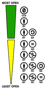
That early team already understood the importance of visual systems that could be used to convey simple but important information to the user, particularly to enhance the planned roll-out of a simple, web-based license chooser system. Color coding of yellow and green was used to express the level of openness for each specific license, with a strong urging for creators to go green and make their work as open as possible to maximize their contribution to the commons. But the question kept coming up — how do we visualize these powerful, new licenses? How could the license deeds be complemented with some kind of visualization or mark? What could be conveyed through those symbols? In the words of Larry Lessig, the Creative Commons identity “needed to be distinctive, yet teach through its design.”
Molly, Glenn and the team knew they needed a strong mark to further convey what each unique license meant, as well as a grander identity to tie them altogether. An identity not unlike the prevailing symbol of copyright in the world, the unmistakable and seemingly indomitable ©. Ryan Junell, who had been working at a series of design leadership roles with startups and design firms in the San Francisco Bay Area, accepted the unusual and exciting offer to create the public face of Creative Commons.
Two very busy weeks
The original project didn’t come with a traditional and detailed design brief. Ryan was plunged into the process, working directly with legal staff to gain an understanding of the licenses and what they meant. The licenses were a quick study for Ryan, having been exposed to the transformative ideas of a young Internet in the late 90’s, in addition to previous gigs with branding and identity projects in silicon valley. He was already well-versed in the complex issues of sharing and copyright in the early days of the web, and understood the importance of a clear and simple way of conveying the spirit and detail of the licenses. He was also thrilled with the idea of working once again in a challenging, high-tempo academic setting.
Ryan and the CC team committed two weeks to the research and study of the new visual system, an ambitious schedule for any design project, much less one that would grow to have such a powerful and broad influence. Inherently, they knew the visuals needed to be simple and effective. They knew they needed a system of icons, and that this system would have to work as efficiently on the printed page as on a web page, video credit crawl, or signage. It should be possible to evoke the symbol with a keyboard [e.g. (CC)] or be easy to draw and recreate free-hand. Creative Commons was focused on global impact, so the system would also have to work across borders and cultures. It would also need to be bold and direct,not overly intricate or sophisticated.
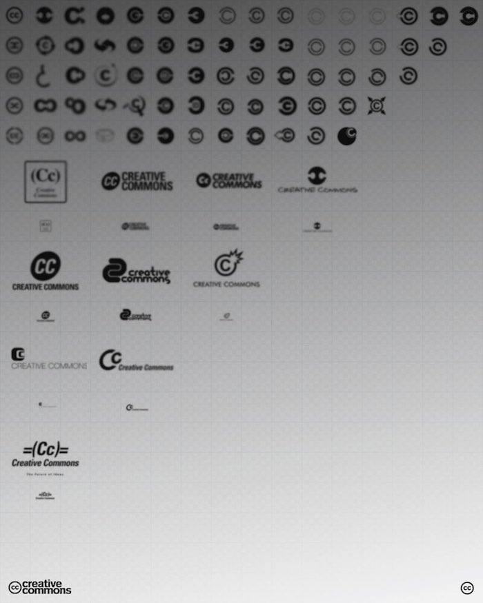
Creative Commons logo development, 2002. courtesy Ryan Junell
![]()
“If you create a question, you create
a reason for people to try to listen.”
Ryan worked through dozens of prototypes, studying the prevalent icons and systems at work at the time, and experimenting with riffs on typography, geometry, and unique letterforms. He shared iterations of early concepts, but the team was immediately drawn to the simple and clear form of the double-c letterforms in a circle. That concept came to Ryan early in the process, and it was idea that felt natural appropriate. He knew it echoed the classic copyright symbol, but it also felt simple, direct, and because of its deviation from the copyright symbol, more welcoming. As Larry later stated, “the multiple meanings of (c) doubled was important. If you create a question, you create a reason for people to try to listen.”
The early concept went through two brisk rounds of improvements but there were minimal changes or diversions from that simple original idea.
With the final “CC” concept clear, it was only a few more steps to build out the rest of the system. Other relevant symbols – the stroked dollar sign, circle-arrow, and originally the letterforms “BY” were suspended in the same bold circle and used to indicate the variants of the licenses: NonCommercial, ShareAlike, and Attribution. As a layered system, these icons were meant to reflect a spectrum of permissions, and would grow to present themselves in their most recognizable, rectangular button forms, set against grey, white, and black.
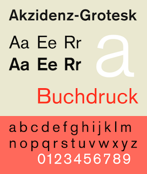
Akzidenz-Grotesk, a modern marvel
It was a masterstroke of design simplicity, and a brilliant way to portray the sharing intent of the licenses. A playful but confident relationship with the traditional copyright logo gave the “CC” logo an instant recognizability, but also a truly unique identity.
Junell set the original “CC” and the subsequent, lowercase Creative Commons wordmark in Akzidenz-Grotesk, an elegant and bold typeface created in the 19th century by Günter Gerhard Lange. It is considered the first true sans-serif typeface, and became a precursor to hundreds, possibly thousands, of subsequent sans-serif typeface through the 20th century. Popular amongst design-thinking tech companies of the time, it also evokes a spirit of simple, clear, public-minded and modern typography. The typeface is instantly recognizable as a mainstay of environmental and way-finding graphics. It is the progenitor of its more recognizable sibling, Helvetica (created in the late 1950’s), and to this day it is still the official typeface of the International Red Cross and its global chapters.
Animating the logo
The Creative Commons team had the identity in place, but they also knew they wanted a more animated, multi-media approach to make a bigger splash. It was early days of internet video (and low bandwidths for average users) but Junell had experience as an animator and was able to develop an idea for a Flash-based video, the first of several videos Creative Commons would release to tell the story of Creative Commons, and to convince new users to take advantage of the new licenses and icons.
“Get Creative” was the first video in this effort, and featured a case study inspired by a real-world creative reuse situation about the White Stripes. Written by Glenn Otis Brown and directed and animated by Junell, the video set the stage for a new and vibrant outreach effort with artists, writers, academics and researchers that continues today. Junell and others often credit this video with being as critical a part of defining the visual story as the logos themselves. In the spirit of the video, digital comic stories also appeared, illustrated by Junell, and written and designed by Neeru Paharia.

From “Spectrum of Rights” by Neeru Paharia, Matt Haughey, and Ryan Junell / CC BY
The initial reception to the release of the licenses and the new logos was incredibly positive. The story brought a breath of fresh air to the technology media, much of which was still reeling from the gloomy, post-bubble narrative. Early adopters of the CC licenses, including MIT, the Internet Archive, and the Electronic Frontier Foundation, sung the project’s praises and embraced the logos for their own CC licensed content. On t-shirts, stickers, pins and signs the logo grew and spread, quickly becoming one (if not ‘the’) prominent brand of the free culture movement. Evangelists, artists, coders and writers in the know proudly showed their support for CC by stickering their laptops, notebooks, and mobile phones. More zealous fans chiseled or dyed the logo into their hair during tech conferences, and more than a few CC tattoos found their way onto the most diehard supporters. The logo was well on its way to becoming the internationally recognizable symbol it is today.

The back of this man’s head has a Creative Commons license by George Kelly / CC BY-NC-ND
The logos grow and adapt
The Creative Commons logos found themselves in an increasingly vast and complex Internet by 2005. The system was still simple enough to work in a wide variety of settings, and new platforms like Flickr and eventually Wikipedia and others would be able to incorporate the licenses and the logos in effective and visible ways. But as the logos became more popular and more global, it was evident that the original concepts would need to be updated. The use of the dollar symbol and the reliance on the ‘BY’ text were the two most prominent challenges. Both were conventional for western, English-speaking audiences but were impractical for use internationally.
Alex Roberts, who began working with Creative Commons in 2005 as its Senior Designer, was tasked with the sensitive job of updating and expanding the logos and looking at a variety of new use cases and scenarios. He introduced the simple stick figure as a replacement for ‘BY’ in the Attribution icon, created the new CC Zero icon, and created two new currency icons with the euro and yen symbols to show variation and internationalization of the NonCommercial logos.
![]()
![]()
![]()
![]()
Additions to the logo family, by Alex Roberts
Roberts also produced the now-standard slim, rectangular license buttons that are in use on millions of websites today, and worked to improve the readability, layout, and clarity of individual license deeds. Roberts is recognized by the MoMA alongside Ryan Junell as a collaborator in the creation and enhancement of the overall design system.
The new logos appeared in an updated Creative Commons explainer video in 2006. “Wanna Work Together?” was again animated by Ryan Junell, and by then Creative Director Eric Steuer.
Today, Ryan Junell is a creative producer working in the greater NYC area. CC’s first Executive Director, Molly Shaffer Van Houweling, is a current CC Board member and Professor of Law at the University of California, Berkeley. Glenn Otis Brown was Executive Director of Creative Commons from 2002 to 2005 and is now an executive with Twitter based in New York City. Alex Roberts was Senior Designer at Creative Commons from 2005 to 2011 and is now a Software Engineer at Eventbrite.
The CC logos today and beyond
Since 2006 the Creative Commons logos have gone through no significant changes, and the CC 4.0 licenses and their representative logos are poised to continue their march towards ever greater visibility and prominence on the web. Their state as acquired by MoMA earlier this month is likely how they will remain for decades or centuries to come, an indicator of the simple elegance and effectiveness of the visuals and the lasting importance of the power of sharing.
In 2014 Creative Commons’ State of the Commons report counted the number of CC works at well over 882 million (with some estimates suggesting that number is well over 1 billion), coming from more than 10 million sites on the web. The majority of those works are available under one of the three most free licenses, ensuring their maximum benefit to the commons. Wikipedia and its sister projects provide virtually all of their media and knowledge under one form or another of the CC licenses, in addition to public domain. Flickr hosts hundreds of millions of CC images and videos alone, and Creative Commons videos and media thrive on Vimeo, YouTube, the Internet Archive and other major media platforms. Millions of students around the world are learning through freely reusable, Creative Commons licensed textbooks, curricula, and other teaching tools.
Creative Commons looks forward to shepherding the logos through the coming decades and centuries as they continue to grow in impact and use. The Internet and the world around it changes more every single day, and we look forward to envisioning how these symbols and the knowledge and media they accompany will continue to flourish and impact the world in yet unknown ways.
Celebrating the CC logo with a specially designed t-shirt
Today we are also excited to announce the availability of an awesome new Creative Commons t-shirt. Thanks to our talented friends at the Noun Project and Teespring, we are inviting fans and supporters to purchase this limited edition t-shirt that proudly celebrates the CC logo. You can read more about the campaign at this blog post, or head over to Teespring to claim your shirt right now – this one-time campaign runs from March 24 to April 7, 2015.
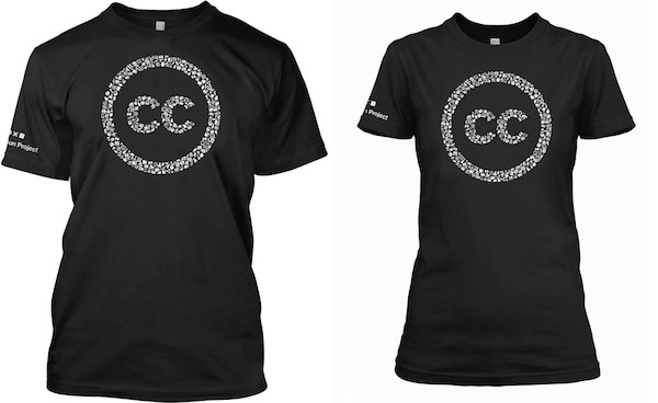
http://teespring.com/creativecommons



Thank you for sharing this story of how an inspiring vision came to be represented in such a recognizable way. The logo, and the concept, produce a visceral and intellectual response that is immediately understood and appreciated. Kudos to Ryan and the CC team!
I really like the CC Logo 🙂