Concept
Version 8
Created by Boundless
The Density Scale

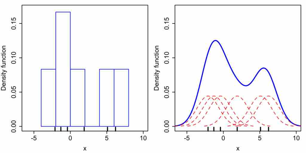
Histogram Versus Kernel Density Estimation
Comparison of the histogram (left) and kernel density estimate (right) constructed using the same data. The 6 individual kernels are the red dashed curves, the kernel density estimate the blue curves. The data points are the rug plot on the horizontal axis.
Source
Boundless vets and curates high-quality, openly licensed content from around the Internet. This particular resource used the following sources:
"Comparison of 1D histogram and KDE."
http://en.wikipedia.org/wiki/File:Comparison_of_1D_histogram_and_KDE.png
Wikipedia
CC BY-SA.