What is a Misleading Graph?
In statistics, a misleading graph, also known as a distorted graph, is a graph which misrepresents data, constituting a misuse of statistics and with the result that an incorrect conclusion may be derived from it. Graphs may be misleading through being excessively complex or poorly constructed. Even when well-constructed to accurately display the characteristics of their data, graphs can be subject to different interpretation.
Misleading graphs may be created intentionally to hinder the proper interpretation of data, but can be also created accidentally by users for a variety of reasons including unfamiliarity with the graphing software, the misinterpretation of the data, or because the data cannot be accurately conveyed. Misleading graphs are often used in false advertising. One of the first authors to write about misleading graphs was Darrell Huff, who published the best-selling book How to Lie With Statistics in 1954. It is still in print.
Excessive Usage
There are numerous ways in which a misleading graph may be constructed. The use of graphs where they are not needed can lead to unnecessary confusion/interpretation. Generally, the more explanation a graph needs, the less the graph itself is needed. Graphs do not always convey information better than tables.
Biased Labeling
The use of biased or loaded words in the graph's title, axis labels, or caption may inappropriately sway the reader.
Improper Scaling
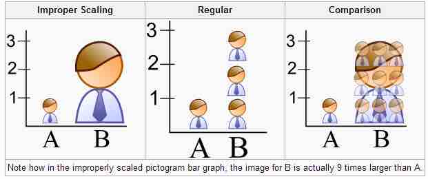
When using pictogram in bar graphs, they should not be scaled uniformly as this creates a perceptually misleading comparison. The area of the pictogram is interpreted instead of only its height or width. This causes the scaling to make the difference appear to be squared.

Improper Scaling
In the improperly scaled pictogram bar graph, the image for B is actually 9 times larger than A.
Truncated Graphs
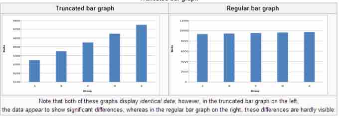
A truncated graph has a y-axis that does not start at zero. These graphs can create the impression of important change where there is relatively little change.Truncated graphs are useful in illustrating small differences. Graphs may also be truncated to save space. Commercial software such as MS Excel will tend to truncate graphs by default if the values are all within a narrow range.

Truncated Bar Graph
Both of these graphs display identical data; however, in the truncated bar graph on the left, the data appear to show significant differences, whereas in the regular bar graph on the right, these differences are hardly visible.
Misleading 3D Pie Charts
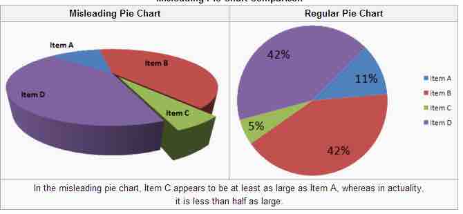
A perspective (3D) pie chart is used to give the chart a 3D look. Often used for aesthetic reasons, the third dimension does not improve the reading of the data; on the contrary, these plots are difficult to interpret because of the distorted effect of perspective associated with the third dimension. The use of superfluous dimensions not used to display the data of interest is discouraged for charts in general, not only for pie charts. In a 3D pie chart, the slices that are closer to the reader appear to be larger than those in the back due to the angle at which they're presented .

Misleading 3D Pie Chart
In the misleading pie chart, Item C appears to be at least as large as Item A, whereas in actuality, it is less than half as large.
Other Misleading Graphs
Graphs can also be misleading for a variety of other reasons. An axis change affects how the graph appears in terms of its growth and volatility. A graph with no scale can be easily manipulated to make the difference between bars look larger or smaller than they actually are. Improper intervals can affect the appearance of a graph, as well as omitting data. Finally, graphs can also be misleading if they are overly complex or poorly constructed.
Graphs in Finance and Corporate Reports
Graphs are useful in the summary and interpretation of financial data. Graphs allow for trends in large data sets to be seen while also allowing the data to be interpreted by non-specialists. Graphs are often used in corporate annual reports as a form of impression management. In the United States, graphs do not have to be audited. Several published studies have looked at the usage of graphs in corporate reports for different corporations in different countries and have found frequent usage of improper design, selectivity, and measurement distortion within these reports. The presence of misleading graphs in annual reports have led to requests for standards to be set. Research has found that while readers with poor levels of financial understanding have a greater chance of being misinformed by misleading graphs, even those with financial understanding, such as loan officers, may be misled.