Introduction to Bivariate Data
Measures of central tendency, variability, and spread summarize a single variable by providing important information about its distribution. Often, more than one variable is collected on each individual. For example, in large health studies of populations it is common to obtain variables such as age, sex, height, weight, blood pressure, and total cholesterol on each individual. Economic studies may be interested in, among other things, personal income and years of education. As a third example, most university admissions committees ask for an applicant's high school grade point average and standardized admission test scores (e.g., SAT). In the following text, we consider bivariate data, which for now consists of two quantitative variables for each individual. Our first interest is in summarizing such data in a way that is analogous to summarizing univariate (single variable) data.
By way of illustration, let's consider something with which we are all familiar: age. More specifically, let's consider if people tend to marry other people of about the same age. One way to address the question is to look at pairs of ages for a sample of married couples. shows the ages of 10 married couples. Going across the columns we see that husbands and wives tend to be of about the same age, with men having a tendency to be slightly older than their wives.

Bivariate Sample 1
Sample of spousal ages of 10 white American couples.
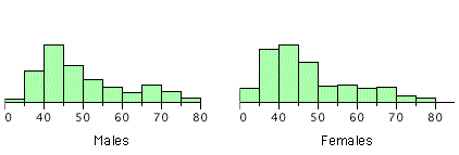
These pairs are from a dataset consisting of 282 pairs of spousal ages (too many to make sense of from a table). What we need is a way to graphically summarize the 282 pairs of ages, such as a histogram. as in .

Bivariate Histogram
Histogram of spousal ages.
Each distribution is fairly skewed with a long right tail. From the first figure we see that not all husbands are older than their wives. It is important to see that this fact is lost when we separate the variables. That is, even though we provide summary statistics on each variable, the pairing within couples is lost by separating the variables. Only by maintaining the pairing can meaningful answers be found about couples, per se.
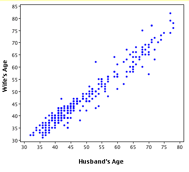
Therefore, we can learn much more by displaying the bivariate data in a graphical form that maintains the pairing. shows a scatter plot of the paired ages. The x-axis represents the age of the husband and the y-axis the age of the wife.

Bivariate Scatterplot
Scatterplot showing wife age as a function of husband age.
There are two important characteristics of the data revealed by this figure. First, it is clear that there is a strong relationship between the husband's age and the wife's age: the older the husband, the older the wife. When one variable increases with the second variable, we say that x and y have a positive association. Conversely, when y decreases as x increases, we say that they have a negative association. Second, the points cluster along a straight line. When this occurs, the relationship is called a linear relationship.
Bivariate Relationships in Qualitative Data
The presence of qualitative data leads to challenges in graphing bivariate relationships. We could have one qualitative variable and one quantitative variable, such as SAT subject and score. However, making a scatter plot would not be possible as only one variable is numerical. A bar graph would be possible.
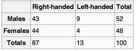
If both variables are qualitative, we would be able to graph them in a contingency table. We can then use this to find whatever information we may want. In , this could include what percentage of the group are female and right-handed or what percentage of the males are left-handed.

Contingency Table
Contingency tables are useful for graphically representing qualitative bivariate relationships.