When constructing probability histograms, one often notices that the distribution may closely align with the normal distribution. The occurrence of the normal distribution in practical problems can be loosely classified into three categories: exactly normal distributions, approximately normal distributions, and distributions modeled as normal.
Exactly Normal Distributions
Certain quantities in physics are distributed normally, such as:
- Velocities of the molecules in the ideal gas. More generally, velocities of the particles in any system in thermodynamic equilibrium will have normal distribution, due to the maximum entropy principle.
- Probability density function of a ground state in a quantum harmonic oscillator.
- The position of a particle that experiences diffusion.
Approximately Normal Distributions
Approximately normal distributions occur in many situations, as explained by the central limit theorem. When the outcome is produced by a large number of small effects acting additively and independently, its distribution will be close to normal. The normal approximation will not be valid if the effects act multiplicatively (instead of additively), or if there is a single external influence that has a considerably larger magnitude than the rest of the effects.
The normal approximation can be used in counting problems, where the central limit theorem includes a discrete-to-continuum approximation and where infinitely divisible and decomposable distributions are involved. This includes Binomial random variables, which are associated with binary response variables, and Poisson random variables, which are associated with rare events.
Assumed Normality
There are many examples of problems in real life that are assumed to be normal. If you were to construct a probability histogram of these events with many trials, the histogram would appear to be bell-shaped. Examples include:
- Certain physiological measurements, such as blood pressure of adult humans.
- Measurement errors in physical experiments. This use of a normal distribution does not imply that one is assuming the measurement errors are normally distributed, rather using the normal distribution produces the most conservative predictions possible given only knowledge about the mean and variance of the errors.
- Results of standardized testing.
How to Assess Normality
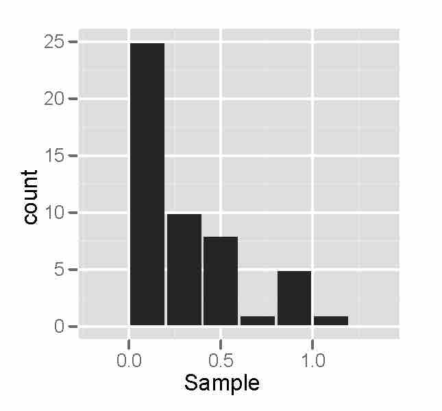
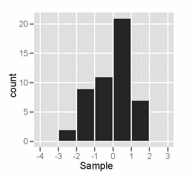
How can we tell if data in a probability histogram are normal, or at least approximately normal? The most obvious way is to look at the histogram itself. If the graph is approximately bell-shaped and symmetric about the mean, you can usually assume normality.
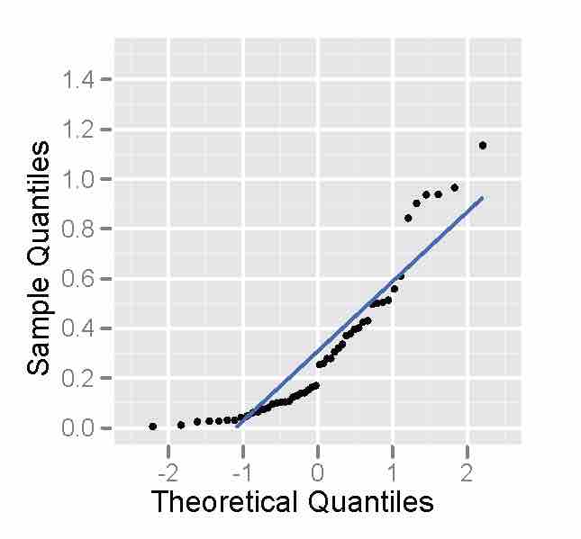
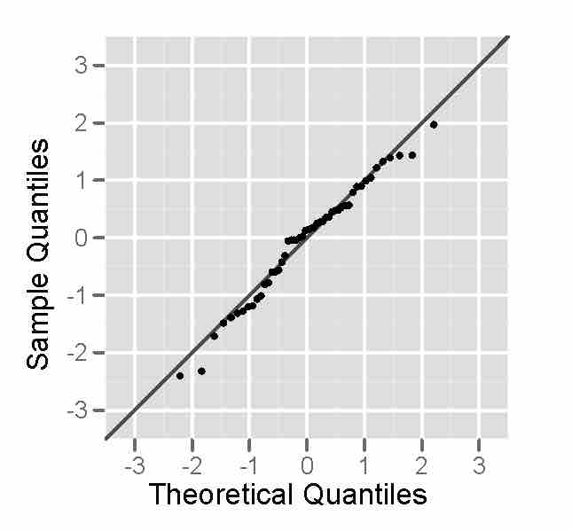
There is another method, however, than can help: a normal probability plot. A normal probability plot is a graphical technique for normality testing--assessing whether or not a data set is approximately normally distributed. The data are plotted against a theoretical normal distribution in such a way that the points should form an approximate straight line (, ). Departures from this straight line indicate departures from normality (, ). It is important to remember not to overreact to minor wiggles in the plot. These plots are not often produced by hand, but rather by technological tools such as the graphing calculator.

Non-Normality - Histogram
This is a sample of size 50 from a right-skewed distribution, plotted as a histogram. Notice that the histogram is not bell-shaped, indicating that the distribution is not normal.

Non-Normality - Probability Plot
This is a sample of size 50 from a right-skewed distribution, plotted as a normal probability plot. Notice that the points deviate on the, indicating the distribution is not normal.

Approximately Normal - Histogram
This is a sample of size 50 from a normal distribution, plotted out as a histogram. The histogram looks somewhat bell-shaped, indicating normality.

Approximately Normal - Probability Plot
This is a sample of size 50 from a normal distribution, plotted as a normal probability plot. The plot looks fairly straight, indicating normality.