Concept
Version 5
Created by Boundless
Introduction to Deadweight Loss

Deadweight loss
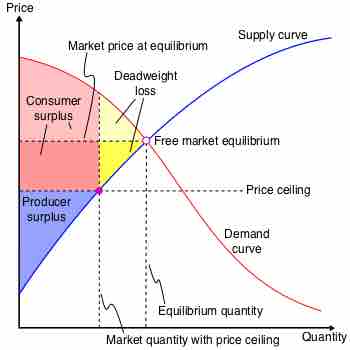
This chart illustrates the deadweight loss created when a price floor is instituted on the market for a good. The amount of deadweight loss is shown by the triangle highlighted in yellow. This area is known as Harberger's triangle.
Source
Boundless vets and curates high-quality, openly licensed content from around the Internet. This particular resource used the following sources:
"Deadweight-loss-price-ceiling."
http://en.wikipedia.org/wiki/File:Deadweight-loss-price-ceiling.svg
Wikipedia
CC BY-SA.