When delivering an effective presentation, very few tools are more effective than good visuals. There are a number of reasons this is true (aside from the common adage that a picture is worth a thousands words). Understanding why visuals are useful and how to go about using them will give you a critical edge at your next big talk.
Why Visuals Matter
The evolution of communication is largely visual, with pictographs dating back thousands of years. At the onset of communication, humans focused on visual representations of ideas. Approximately 60-65% of people see a series of pictures when listening or looking at a series of words. This is an enormous portion of your audience, so speak their language!
Encoding and Decoding
This image demonstrates the way in which we code and decode messages we send to one another. When I think to say the word tree, and then proceed to say it, you process the word tree and then proceed to think it. Simplifying communication with imagery can often bypass much of the coding and decoding that slows us down.
Aside from this, sometimes the most efficient way to communicate a point with clarity is to wrap up various premises and your core conclusion in one clean image. This can be accomplished through diagrams, charts, tables, graphs, models, and even internet memes. The more creative and memorable the image, the more likely it'll stick in the forefront of their minds after you've gone (which is, after all, the point of all of this).
How To Visualize Well
Specialists in memory and human comprehension confirm that the human mind simply can't hold all that many words, numbers, or concepts simultaneously. This presents a challenge when communicating complex ideas to a crowd. Distilling complex ideas into an elegant display can aid in this process.
Some of the most useful tools at your disposal are the simplest. Focus on chunking your information, organizing your content, ensuring relevance, creating visual alignment, and emphasizing a single main point. Below is a list of visual aids you can consider, with a brief description of how they are best utilized:
- Physical Objects and Diagrams: These are quite useful when 3-dimensional thinking is required, or when the skill being taught is hands-on. They are not so useful when they are big, distracting, and unwieldy.
- Graphs: For delivering complex data in a single and elegant expression, graphs can't be beat. However, if there are multiple key concerns and countless possible conclusions, a graph can be quite misleading.
- Photographs: Photos work best when the human element is useful, as they tend to create a sense of empathy and connection. However, photos aren't as effective at abstraction.
- Maps: Spatial reasoning is difficult, so don't make people walk through a city via text. Visually showing a map immediately enables your audience to have a strong sense of scope and direction. However, know your audience and keep it simple – maps can also be quite intimidating when over-populated with points of interest.

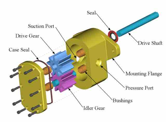
Gear Pump Diagram
This image shows the breakdown of a gear pump as a technical diagram, with each part clearly labeled and color-coded for ease of understanding. This is an excellent example of how a diagram can help us avoid complex coding and decoding of words, and instead paint a clear image of functionality directly from a visual aid.